
Southern California native Roderick Reed creates interiors that reflect the passions of his clients using coastal culture combined with international traditions in his design. The Laguna Beach resident is a master at developing personal interiors through an artistic view that captures present trends with a timeless design.
Q: You describe your work as “high-end design concepts styled in a transitional fashion.” Please illustrate what transitional fashion is for interior design.
A: Think of clothing designers with beautiful dresses and fabrics. Interior design is like that, choosing colors that are pleasing at that point in time. Take a room and put drapery with a certain color along with a rug, pillows, etc. Clothing it would be a particular color dress with shoes, a necklace that defines the fashion. And fashion changes. It’s a little thought designers struggle over. Do you design classic or contemporary? For me, I design with an element of classicism so it doesn’t look dated after time.
Q: For example?
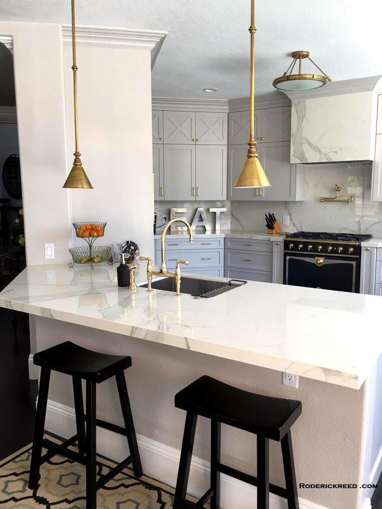
A: Right now I might have a room with paint colors on the wall in classic colors and a floor made of traditional materials. And I’ll throw in some pillows that are a bit wild or whatever is cool and trending to dress up the area. By 2019 the trendy stuff starts to change and so pillows and other accessories can be switched out to update the look. The house wouldn’t need to be painted or the floors redone. Mixing classicism with the design helps the design endure and allows me to be more adventurous with other details. Right now the Color of the Year for 2018 is Benjamin Moore’s Caliente (AF-290), a strong and radiant color. Color is a big topic right now. We are in a new year and things are shifting. Fashionable metals like gold are replacing the long-lived, oil-rubbed bronze and satin nickel on bath and kitchen fixtures. Stained glass is also making a come back.
Q: Tell me more about Caliente. Will it look dated in a couple of years?
A: Each year a new color comes out. The color of the year is an indication of colors you’ll start to see in fabrics, auto paint, fashion and interiors. We really don’t know how long the public will embrace the color. Some colors came to define a decade like orange in the ‘70s, white in the ‘80s, and mauve in the ‘90s. Will Caliente be the Orange of its time? We don’t know. Only time will be the judge. If you want to make this red feel more classic place it as an accent against traditional fabric and colors.
Q: So what are classic colors?
A: Color palettes don’t get any more simple or classic than black and white. The high-contrast combination is sophisticated and dramatic.
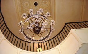
Q: How is stained glass coming back in trend and in what ways is it different from the past?
A: Data compiled by Google Trends reveals the historic style “Victorian” was the most searched design trend across the U.S. characterized by wrap-around porches, stained glass, and ornate accessories. Tiffany stained glass windows and lamps are back in their traditional form. The last time stained glass was hot was in 1978! Design magazines are displaying pictures of lamps, vases and glorious “old school” windows. If you aspire to be a little traditional yet hip at the same time, display some of your parents old stained glass pieces in a room with an accent wall painted Caliente!
Q: How do your designs differ from other interior designs?
A: I create interiors that capture the individuality of the owners. I put personal touches into it and do it right. The response is always very positive. A good example is a new remodeling project I have in Newport Beach. My client’s dog sleeps with them in their bedroom. One of the things I did with the room was to design a dog bed that matches their bed. When I showed them the illustration of the room they loved it! Little things like taking in account a well-loved pet goes a long way in creating a personalized design for my clients.
Q: Do you have a special process when designing?
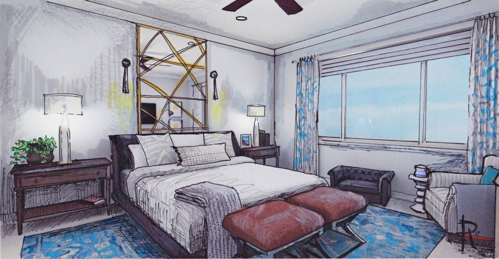
A: The way to bring the design home is during the first meeting with my clients. It’s up to me to pull the design out of them. I try to get inside their heads and figure out what styles are their favorites. I observe what kind of books they have, what page their magazine is turned to, what they are wearing. I get a good sense of people that way. The process is a little bit of psychology, good listening, and good observing. I ask questions, and listen to what they have to say. Most people have viewed my website beforehand and comment on the pictures they have seen, which helps me understand the aesthetics they are seeking or what interests them. To help them visualize the design I have in mind, I use my art background. I hand-draw a few different angles of the room I am working on and present them along with samples for my clients to see and get a feel of what I want to do. Once they see all of that, they are on board – on fire – with the design. It’s such a positive experience, for me and my client. It’s why I love what I do.
Q: How does an art background help you with your design?
A: Interior design is just a three-dimensional painting. It is color, scale and beauty. If you have those three elements worked out in your design, it is art. The best interior designers are artists. You can always learn which colors look good and how to sort tile. But if you don’t understand how to sort scale and beauty, the design won’t be pleasing. The successful designers are ones that have some type of artistic background. It’s something deep in their soul that makes them think and see the world a bit differently.
Q: Do you have certain techniques you bring as an artist?
A: Often when I go into a space to design, I’ll look at it upside down. In art school a lot of artists flip a painting upside down to refine their composition. Before digital cameras, I would literally stand in a room and cock my head so I can see it upside down. Now I simply snap a photograph and turn it upside down to truly examine the finer details for balance. The human eye craves balance. The color palette can’t be too bright or too distracting. You might have a beautiful blue rug that sets the mood and draws the focus to that spot. But from there, you want the eyes to travel gradually around the place in a peaceful unwinding of the space.
CONTACT INFO
Roderick Reed
Interior Designer
REEDesign Interiors
PO Box 4889
Laguna Beach, CA 92652
Phone: 949-715-5356
http://roderickreed.com/
By Gina Dostler


