The classic combination of black and white is revived with fresh approaches to interior design.
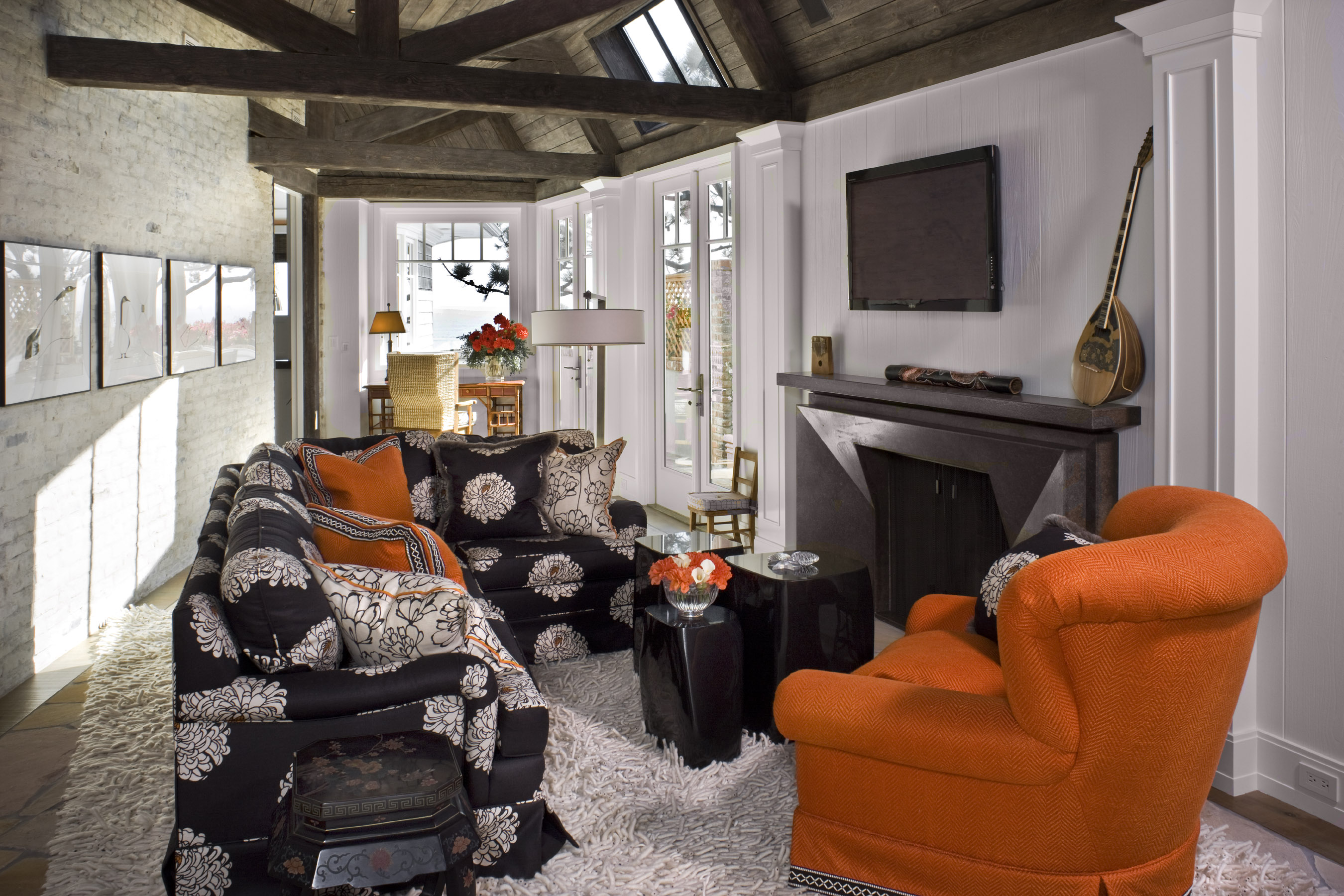
Black and white has long been a popular pairing in both fashion and home decor. It isn’t surprising that the combo is consistently en vogue, as it’s incredibly versatile. “You can mix just about anything with it,” says Sheldon Harte, principal of Laguna Beach interior design firm Harte Brownlee & Associates. “It really is, in its own way, kind of a neutral palette.” Harte says the latest trend seems to be emphasizing black as the dominant color and then accenting with white—think dark walls with light trim. This is a major change from the white-on-white kitchens (white cabinets, white counters), for example, which have been popular in recent years. For those looking for a bold update, he suggests painting those cabinets a glossy black to transform the space. In addition to cabinetry, Harte is a fan of incorporating black and white in other “background” elements, such as flooring and stone. With a neutral foundation in place, it’s easy switch up the smaller decorative features to refresh the overall look. “You can easily warm it up by throwing some color in,” Harte says. “I think a lot of people get stagnant, but by changing just a few things, you have a great basis that you can accent.” For example, you could try rotating different colored textiles to reflect the theme of each season. Or, if you would rather stick with an all black-and-white palette, look to new prints. “You could use more geometric patterns and keep it really architectural feeling, or you could throw in classical damask patterns and it would have a whole different vibe,” Harte says. And while mixing patterns is a popular technique, it can be tricky to execute. Harte cautions to keep scale in mind—when using a variety of black-and-white prints, be sure to balance a combination of both large and small pieces. Balance, in general, is essential to successfully decorating with this color combo, but Harte notes that there’s no perfect ratio. “It’s just about having a sensibility,” he says. “It could be a 50-50 thing, but usually it’s one [color] accented by the other.” At the end of the day, it’s all about experimenting. As Harte says: “Be brave, but do it in good taste.”
Section by Katherine Duncan


